Retrieve Data from Microsoft Excel
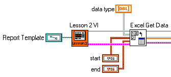
In Figure 1, the Lesson 2 VI represents the code developed in the first and second parts of this tutorial, which teach you how to open Excel, add and rename worksheets, add data to a worksheet, and manipulate that data with functions and macros.

Figure 1. Retrieving Data from an Excel Worksheet
Before you can create a graph, you need to have the data values in one array within LabVIEW. Because you added data at two different points in the VI, the easiest way to gather those values into one array is to read them back from the Excel worksheet. Use the Excel Get Data VI to retrieve the data from the worksheet to LabVIEW. This VI reads a large data set after you specify a cell range and expected data type.
Create a Graph
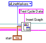
After retrieving the data, create a graph on the worksheet. Excel contains several default graph types you can use to portray the data. In this case, select a line graph with marker points embedded as an object in the worksheet to plot the sample data. Alternatively, you can use the toolkit to create graphs as objects not embedded in a worksheet if you only need to present data visually without accompanying text. As shown in Figure 2, you can use the Excel Easy Graph VI to create a graph of any valid Excel data type and to specify a title and position.

Figure 2. Creating a Graph on an Excel Worksheet
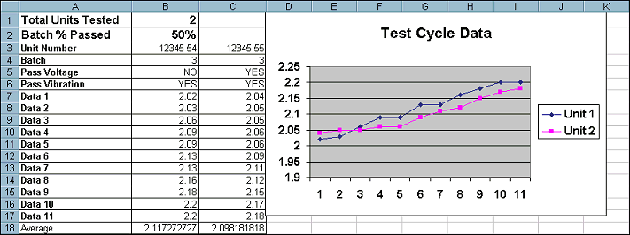
Figure 3 shows the effect of adding the graph through LabVIEW.

Figure 3. Graph Added to a Report in an Excel Worksheet
Use Advanced Graph Options
If you want to customize a graph beyond the options offered in the Excel Chart Wizard, the toolkit includes a full suite of VIs you can use to modify and customize graphs. Figure 4 shows the Excel Set Graph Colors, Set Graph Font, and Set Graph Scale VIs, which adjust the properties of a graph programmatically from LabVIEW.

Figure 4. Customizing the Marker Style, Fonts and Axis’s of an Excel Graph
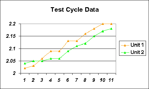
Figure 5 shows the modified graph included in the final report.

Figure 5. Customized Graph in an Excel Worksheet
These advanced options of the LabVIEW Report Generation Toolkit for Microsoft Office reduce development time and eliminate the need to manually polish the final report.