It is possible to plot data using different scales by using multiple axes on the same graph. Please follow the steps below.
- Place the chart or graph indicator on the front panel.
- Right-click the axis on which you want to create multiple scales and select Duplicate Scale. For example, if you want to create two different Y-axis scales for one X-axis scale, right-click the Y axis and choose Duplicate Scale.
- Right-click the second axis, select Swap Sides, and the second scale will be moved to the right side.
- Open the block diagram. Right-click the chart/graph icon and choose Create>>Property Node>>Active Plot.
- Place the property node anywhere on the block diagram.
- Right-click the ActPlot property node and select Change All To Write.
- Extend the property node. Left click on the second property and select Plot>>Y Scale Index (when creating multiple Y axes).
- Wire numeric constants to the ActPlot and Plot.YScaledx property nodes.
Graph/Chart will be plotted on the default original scale unless you configure it using the property node. If you want to use a new scale for the plot, wire the plot number to the
ActPlot and numeric constant 1 to
Plot.YScaledx.
Figure 1 shows a simple example program of generating three plots, allocating the default axis of label name Temperature to the first two temperature vectors and allocating a new axis of label name Noise to the last plot, while Figure 2 shows the resulting waveform graph.
Figure 1: Configuring property node
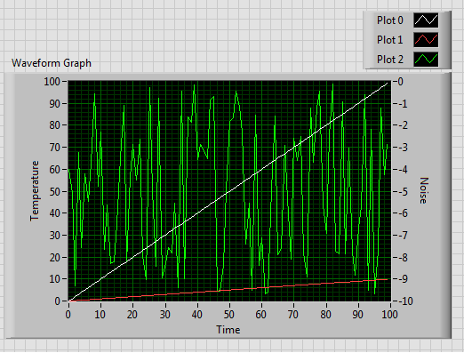
Figure 2: Waveform graph of multiple Y axes